

The Ultimate Guide to Automated Monthly Report Dashboards
The Ultimate Guide to Automated Monthly Report Dashboards
Still Spending Hours Every Month on Reporting? There’s a Better Way
Automated monthly report dashboards pull data from all your tools into one live view — no spreadsheets, no copy-pasting, no formatting marathons.
Here are the top tools to consider in 2026:
| Tool | Best For | Key Strength |
|---|---|---|
| DashThis | Marketing agencies | 30+ integrations, white-label |
| Bricks | AI-generated reports | 60-second report creation |
| SlideMaker | Financial reports | Google Sheets auto-rebuild |
| Looker Studio | Flexible BI dashboards | Free, highly customizable |
| Grafana | Technical/ops teams | Scheduled PDF/CSV delivery |
Think about how your Monday mornings probably look right now. You open five browser tabs, export data from Google Analytics, copy numbers into a spreadsheet, paste charts into slides, and spend two hours making it all look presentable — only for the numbers to be outdated by the time anyone reads them.
You’re not alone. The average facility manager spends over 16 hours per month on manual reporting alone — nearly 200 hours a year. For small business owners juggling marketing, operations, and client work, that number hits even harder.
The good news? Businesses that switch to automated reporting save up to 90% of the time they previously spent on these tasks.
This guide breaks down the best automated monthly report dashboard tools available in 2026, what to look for, and how to choose the right one for your business.
I’m Gianna Heron, founder of Herow Marketing — with a background spanning Wall Street finance, brand strategy, and data-driven digital marketing, I’ve seen how automated monthly report dashboards transform the way small businesses track performance and make decisions. Let’s cut through the noise and find the right solution for you.

Basic automated monthly report dashboards glossary:
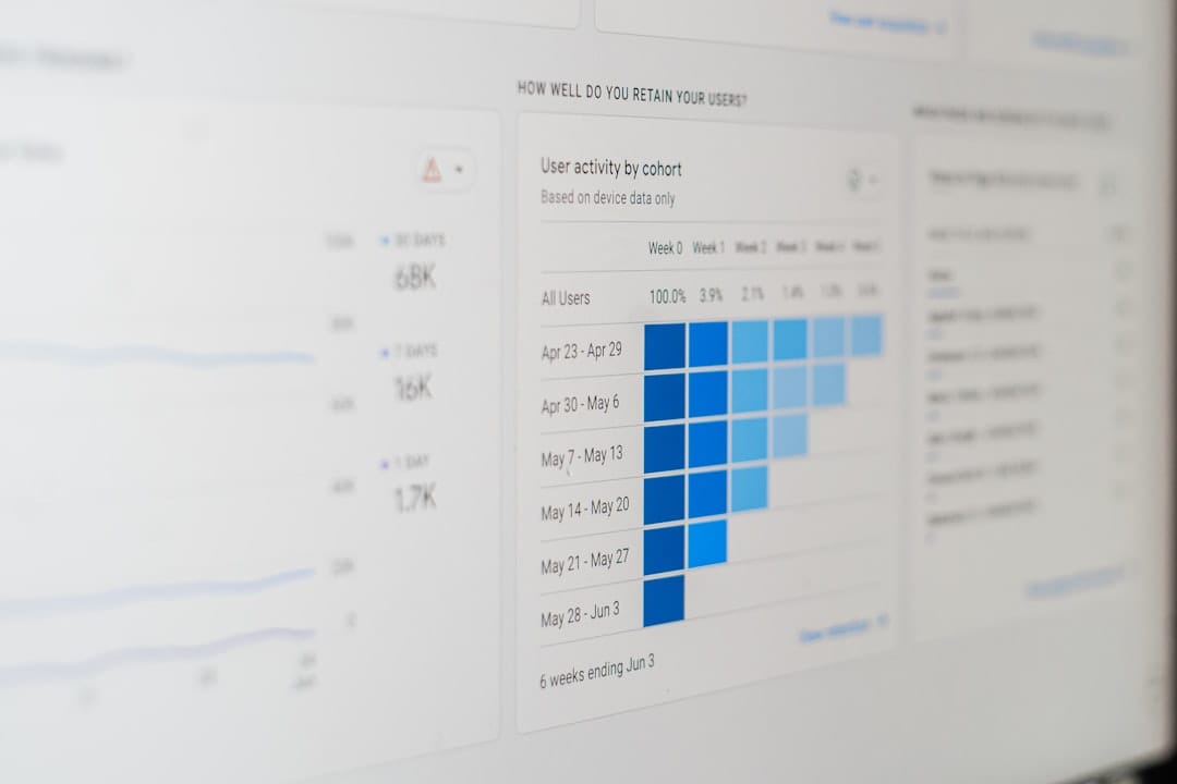
Why Your Business Needs Automated Monthly Report Dashboards
Let’s be honest: manual reporting breaks down the moment your business starts to scale. When you are small, copying and pasting a few numbers from your website into an Excel sheet is manageable. But as you grow, your data gets fragmented across Google Analytics, social media profiles, CRM platforms, accounting software, and email marketing tools.

When you rely on manual reporting, you face several major bottlenecks:
- Delayed Decisions: If your team has to compile data manually, your reports are often days or weeks behind. You are making decisions based on what happened last month, not what is happening right now.
- Inconsistent Metrics: If different team members pull data using different parameters, you end up with conflicting numbers.
- Wasted Resources: Without automation, finance and marketing teams can spend up to 80% of their reporting time on preparation and only 20% on actual analysis.
By transitioning to automated monthly report dashboards, you completely flip that ratio. According to industry data, automating your reporting processes can lead to a 60% reduction in report preparation time. Instead of spending 25 hours a week compiling financial data, some teams have reduced that workload to just 5 hours a week. That is a massive operational saving that translates directly to your bottom line—often saving businesses up to $60,000 a year in manual labor costs.
Beyond the financial savings, automated dashboards democratize your data. They establish a single source of truth that is accessible to all stakeholders. When everyone is looking at the same real-time data, decision speed can increase by up to 300%.
To understand how this fits into your overall digital strategy, check out our guide on Automated Reporting: The Real Benefits and dive deeper into building your analytics foundation with The Ultimate Guide to Your First Analytics Dashboard Setup.
Key Features and Integrations of Automated Dashboards
A great monthly dashboard is much more than a collection of pretty bar charts. To truly drive business growth, it needs to be dynamic, secure, and deeply integrated with your existing software stack.
When evaluating dashboard platforms, look for these core capabilities:
- Customization and Brand Themes: Your reports should look like they belong to your business. Look for platforms that allow you to customize color palettes, upload logos, and apply custom brand themes.
- Scheduling and Automated Delivery: You should be able to schedule reports to send automatically on a recurring cadence—such as the first business day of every month—accounting for weekends and local holidays.
- Role-Based Access Control: Not everyone needs to see every metric. Secure dashboards allow you to set permissions so that clients, executive leadership, and operational teams only see the data relevant to them.
- Historical Comparison: To understand your trajectory, your dashboard must support month-over-month (MoM) and year-over-year (YoY) comparisons. This helps separate normal seasonal volatility from genuine performance trends.
Essential Data Integrations for Automated Monthly Report Dashboards
An automated reporting tool is only as good as its data pipelines. To build a comprehensive view of your business, your dashboard needs to connect directly to your primary data sources via secure API connections.
For example, a standard marketing and sales dashboard should seamlessly pull data from:
- Google Analytics (GA4): To track website traffic, user behavior, and conversion paths.
- CRMs (like HubSpot or Salesforce): To monitor lead pipelines, customer acquisition costs, and sales team performance.
- Payment Gateways (like Stripe or Plaid): To track monthly recurring revenue (MRR), gross revenue, net burn, and cash runway.
- Paid Media Platforms (Google Ads, Meta, LinkedIn): To aggregate ad spend and return on ad spend (ROAS).
Connecting these sources ensures your data is always fresh. While some platforms limit scheduled refreshes, advanced automated data pipelines can refresh your data as frequently as every two minutes. This eliminates the “data lag” that plagues traditional reporting.
To learn more about connecting these pipelines, read How to Automate Data Visualization for Monthly Stakeholder Reports.
AI Insights and Narrative Summaries in Monthly Reporting
One of the most exciting advancements in 2026 is the integration of Artificial Intelligence into automated reporting.
Raw data can be overwhelming for stakeholders who do not live in analytics platforms every day. AI bridges this gap by automatically generating narrative summaries and executive synopses alongside your charts.
Instead of just showing a line chart of declining traffic, an AI-powered engine can analyze the data, detect the anomaly, and write a summary like: “Organic traffic decreased by 12% this month due to a drop in rankings for key search terms, though conversion rates remained stable.”
This technology allows tools like Investor Reporting – Starch to pull live financial metrics from Stripe and Plaid, combine them with real-time industry research, and draft a complete, board-ready investor update in minutes. Founders spend just 10 to 15 minutes reviewing the draft instead of spending days building a deck from scratch.
Selecting the Right Tools for Your Automated Monthly Report Dashboards
Choosing the right reporting tool depends heavily on your team’s size, technical expertise, and specific business goals.
To help you decide, we’ve compared building custom in-house dashboards against using specialized, outsourced software-as-a-service (SaaS) tools:
| Feature | In-House BI (e.g., Looker Studio, Power BI) | Outsourced SaaS (e.g., DashThis, Bricks) |
|---|---|---|
| Setup Complexity | High (requires data mapping and API configuration) | Low (plug-and-play templates) |
| Maintenance | High (requires ongoing pipeline management) | Low (managed by the software provider) |
| Customization | Unlimited (build anything from scratch) | Moderate to High (templated layouts, brand themes) |
| AI Capabilities | Manual integration required | Built-in narrative summaries and insights |
| Cost | Low software cost, high development cost | Monthly subscription fee ($44+/month) |
Choosing the Best Automated Monthly Report Dashboards for Your Team
When selecting a tool, consider how your team will actually interact with it. A dashboard that is too complex will quickly be abandoned.
- For Marketing Agencies: Tools like DashThis are highly popular. Used by over 18,000 marketers across 122 countries, it integrates with 30+ marketing platforms and supports over 500,000 KPIs. It allows agencies to reduce monthly client reporting time from 30–40 hours down to just 10–20 hours.
- For Cross-Channel Overview: If you want to see the impact of your efforts across SEO, paid ads, and social media without jumping between platforms, choose a tool that aggregates these metrics into cohesive, multi-channel views.
To see how specialized tools can streamline your social channels, read our analysis on One Dashboard to Rule Them All: Top Social Media Tools.
Financial and Operational Dashboard Solutions
If your primary focus is tracking financial health, your dashboard needs to handle complex accounting data rather than just marketing clicks.
For startups and growing businesses, monitoring P&L, cash flow, and runway is critical. Tools like SlideMaker allow you to connect a Google Sheet or QuickBooks export and automatically generate a polished, board-ready financial deck every month.
These financial dashboards can automatically handle carry-forward adjustments, currency conversions for global teams, and dual-axis charts that plot revenue and volume simultaneously to show shifts in unit economics.
To get started with automated financial decks, check out the Automated Financial Report | Monthly P&L, Cash Flow, KPI Decks From Google Sheets | SlideMaker tool.
Best Practices for Designing Actionable Monthly Dashboards
To ensure your automated dashboards drive real business growth, you must design them with the reader in mind. A messy dashboard is just as useless as a messy spreadsheet.

Follow these best practices to design clear, stakeholder-friendly dashboards:
- Define Your Audience First: An executive dashboard should focus on high-level business goals (revenue, customer acquisition cost, conversion rates). An operational dashboard for your team can include granular metrics (click-through rates, page speed, bounce rates).
- Prioritize Leading and Lagging Indicators: Include lagging indicators to show past performance (e.g., revenue generated last month) alongside leading indicators to predict future trends (e.g., new leads generated, email signups).
- Establish a Visual Hierarchy: Place your most important KPIs at the very top in large scorecard widgets. Follow with trend charts in the middle, and place detailed data tables or appendices at the bottom.
- Avoid Vanity Metrics: If a metric does not directly influence a business decision, remove it. Focus on 5 to 7 core KPIs that tell a cohesive story.
- Include Actionable Commentary: Always leave space for human or AI commentary to explain the “why” behind the numbers and outline the next strategic steps.
This structured approach ensures your team stops guessing and starts auditing your performance effectively. For a step-by-step framework, read our guide on how to Stop Guessing and Start Auditing with These Website Audit Steps.
Frequently Asked Questions about Automated Monthly Reporting
How long does it take to set up an automated monthly dashboard?
Once you select a tool, connecting your data sources via OAuth (such as logging into your Google Analytics or Stripe account) takes only a few clicks. If you use pre-built templates, you can generate your first comprehensive monthly report in under 90 seconds. However, mapping custom APIs or building highly customized database pipelines can take a few hours to set up initially.
How do automated dashboards handle late or pending data?
Many financial and operational metrics (like finalized monthly revenue or reconciled bank transactions) arrive a few days late. Advanced dashboards handle this by using a “Pending Data” flag. The system can automatically publish a preliminary report on the first of the month and then re-issue an updated, finalized version once the late-arriving data is reconciled.
Can automated reports be fully white-labeled for clients?
Yes. Professional reporting tools allow you to fully white-label your dashboards. You can host reports on your own custom domain, apply your company’s custom color themes, and completely remove any third-party software branding before sending them to clients.
Conclusion
Implementing automated monthly report dashboards is one of the smartest operational upgrades your business can make in 2026. By eliminating manual data collection, you save hundreds of hours a year, reduce human error, and gain the real-time insights needed to outpace your competition.
At Herow Marketing, based in Bethlehem, PA, we believe in complete transparency. Our time-tested strategic playbook is backed by clear, automated monthly data reports that connect your marketing efforts directly to measurable business growth.
Ready to elevate your brand and simplify your reporting? Partner with Herow Marketing for branding services and let us help you turn your data into your greatest competitive advantage.